On Data Visualisation in Structural Analysis
Data visualisation is not decoration – it is the interface through which structural analysis becomes inspectable. This essay shows why analytical-looking charts are not enough, how IBCS preserves meaning, and what happens when visuals drift into narrative instead of examination.
1. Why Data Visualisation Matters in Structural Analysis
In management reporting, the purpose of analysis is to support understanding, judgement, and decision-making. For this to occur, analysis must be inspectable. It must be possible for readers to examine how outcomes arise, to question relationships, and to develop confidence in the reasoning presented.
Structural analysis is therefore not complete when it has been performed by the analyst. It is complete only when it can be examined by someone other than the analyst – by leaders, peers, and stakeholders in organisational settings. Reasoning that cannot be inspected may still be correct, but it cannot be relied upon systematically.
Data visualisation matters because it is the primary means through which structural analysis becomes inspectable in management reporting. It is the interface through which reasoning is encountered, interrogated, and reused. Without effective visualisation, structural relationships remain implicit, accessible only through explanation or personal interpretation.
This is especially important in recurring reporting environments. Performance reports are produced on a fixed cadence and reviewed by the same audiences over time. In such settings, analysis is not a one-off act of insight, but a repeatable system. Visualisation is the interface that shapes whether that system trains its audience to understand structure, or merely to accept conclusions.
When visualisation supports inspection, readers can revisit the same analytical structure across periods, test new data against it, and ask new questions within its boundaries. Understanding accumulates. When visualisation does not, reasoning must be re-explained each cycle. Insight does not compound; it resets.
The consequence is not merely inefficiency. When reasoning cannot be inspected visually, authority shifts from examination to explanation. Confidence rests on trust in the explainer rather than on confidence derived from examining the structure itself. Over time, this undermines the reliability of management reporting as a decision-support system.
Data visualisation is therefore not a downstream concern or a presentational choice. In the context of structural analysis, it determines whether reasoning becomes a shared organisational asset or remains a private cognitive process. Understanding that role requires first being clear about what structural analysis actually is – which is the concern of the next section.
2. Structural Analysis as an Outcome, Not a Technique
Structural analysis is often described in terms of the techniques used to perform it. Financial models, driver trees, reconciliations, and visualisations are treated as evidence that structural analysis has taken place. This focus on method is understandable, but it obscures a more fundamental distinction.
Structural analysis is not defined by how it is performed. It is defined by what exists once the analysis is complete.
An analyst may apply sophisticated techniques and still fail to produce structural analysis. Calculations may be correct, drivers may be enumerated, and visuals may look analytical, yet the resulting artefact may not allow others to examine how outcomes arise. In such cases, technique has been applied without producing a structure that can be engaged with.
Conversely, structural analysis can emerge from relatively simple techniques. When relationships are clearly articulated, assumptions are stable, and causal logic is coherent, a structure can be formed even with modest analytical tools. The defining feature is not the method used, but whether a coherent structure has been created.
Understanding structural analysis as an outcome changes the evaluative question. Instead of asking which techniques were used, we must ask what has been produced. Does a structure now exist that can be examined, questioned, and reused? Or do the results still depend on explanation by the analyst who produced them?
If structural analysis is an outcome, its existence cannot be inferred from the presence of models, calculations, or charts. It must be demonstrable in the reporting artefact itself. This creates the need for a criterion that allows us to determine whether a structure has actually been produced, independent of the techniques employed. Identifying that criterion is the task of the next section.
3. Inspectability as the Criterion of Structure
If structural analysis is understood as an outcome rather than a technique, a natural question follows: how do we know when it exists? In management reporting, the answer is not clarity, insight, or persuasion. It is inspectability.
Inspectability refers to the ability of a reader to reconstruct the underlying reasoning by inspection, without reliance on explanatory narration. A structure is inspectable when its causal logic, relationships, and trade-offs can be examined directly in the artefact that presents it. The reader does not need to be told what matters or why; they can see it for themselves.
This distinguishes inspectability from explanation. Explanation guides attention. It selects, summarises, and interprets. Inspection, by contrast, enables verification. It allows the reader to trace how outcomes arise from drivers, how components interact, and how changes propagate through the structure itself. Where structure is not inspectable, explanation becomes necessary for understanding; where structure is inspectable, inspection is sufficient for validation.
Inspectability therefore imposes a higher standard than apparent clarity. A report may be easy to read and still be uninspectable. It may convey a conclusion efficiently while withholding the structure required to test that conclusion. In such cases, understanding depends on trust in the explainer rather than confidence derived from examining the reasoning.
The test of inspectability is practical. When presented with new data, can the same structure be used to examine it without reinterpretation? Can alternative questions be asked within the structure, rather than around it? Can the reader verify claims without requesting additional breakdowns or narrative support? If the answer is no, structure may be present implicitly, but it has not been made inspectable.
This is why inspectability is the governing criterion of structural analysis. It is not a stylistic preference or a communication goal. It is the condition under which reasoning becomes external, examinable, and reusable. Without inspectability, analysis remains private, even when its results are shared.
If inspectability is the test, the next question is what makes it possible. Sound reasoning is clearly required, but reasoning alone is insufficient. For inspection to occur, reasoning must be externalised in a form that preserves its logic. Understanding how that happens requires examining the conditions under which structure becomes visible.
4. What Makes Structural Analysis Possible
If inspectability is the criterion of structural analysis, the next question is what makes it possible in practice. The answer is not a single technique or visual, but a conjunction of conditions. Structural analysis becomes possible only when sound analytical reasoning is made externally inspectable.
Analytical soundness is a necessary starting point. Reasoning must be logically coherent, causally aligned, dimensionally consistent, and collectively explanatory. Drivers must be defined with precision, relationships must be explicit, and outcomes must be derivable from the structure itself. Without this, there is no structure to inspect – only calculation or narrative.
Yet analytical soundness alone is insufficient. Reasoning that remains internal to the analyst’s mind, implicit in working papers, or scattered across spreadsheets cannot be inspected by others. Even when conclusions are correct, unexternalised structure remains private. It can be explained, but it cannot be examined.
For structural analysis to exist as a shared analytical object, reasoning must therefore be externalised. Relationships must be made visible, not merely described. Dependencies must be expressed in a form that allows readers to trace how outcomes arise, how components interact, and how changes propagate through the system. Externalisation transforms reasoning from a personal analytical process into a public cognitive structure.
This introduces a critical distinction between showing a structure and making a structure inspectable. An analyst may think structurally yet still present results in a way that obscures that structure. Conversely, external artefacts may appear structured while encoding no valid reasoning. Structural analysis emerges only when sound reasoning and faithful externalisation coincide.
Faithful externalisation also imposes discipline, in the same way that maps and sheet music do. By encoding items, relationships, and structure in a shared notation, it constrains interpretation. Different readers, at different times, can inspect the same structure and arrive at the same understanding without mediation. Inspectability is therefore not merely a reporting preference, but an analytical commitment. It requires reasoning to be expressed in a form whose meaning does not depend on who explains it.
This leads to a practical and often overlooked tension. In management reporting, externalisation is overwhelmingly achieved through visual artefacts. These artefacts become the primary interface through which structure is inspected – or mistaken for structure itself.
5. Charts as the Vehicle for Externalising Analysis
In management reporting, analytical reasoning is externalised primarily through charts, including tables, and through combinations of charts arranged within reports and dashboards. These artefacts are the means by which analysts make their thinking visible to others.
Charts therefore play a dual role. First, they externalise the analyst’s reasoning. Whatever structure the analyst has formed – the choice of drivers, the relationships between them, the way outcomes are decomposed – is expressed through the selection of charts, the organisation of data within them, and the way multiple charts are combined. Whether that reasoning is sound or flawed, it is made visible through these artefacts.
Second, charts shape how readers perceive that reasoning. They influence which relationships appear salient, which comparisons feel legitimate, and which questions can be asked naturally. A chart frames how analytical thinking is encountered and interpreted. The same underlying analysis, rendered through different charts or arrangements, can invite inspection or discourage it.
Because of this dual role, chart choice and arrangement are analytically consequential. They mediate access to the analyst’s thinking. In practice, however, charts are often selected with limited analytical consideration. Familiar chart types are reused, tables are formatted by convention, and recognised analytical patterns are assembled into dashboards or packs. The emphasis is frequently on producing charts that look analytical, or on arranging charts to resemble known analytical patterns.
This gives rise to a widespread assumption. The presence of charts, particularly analytical-looking charts or familiar analytical patterns, is taken as evidence that structure exists and can be inspected.
Whether charts actually make structure inspectable is a separate question altogether. Clarifying that question is the task of the next section.
6. Charts and Visible Analysis Patterns Are Not the Same as Structural Analysis
A common source of confusion in management reporting arises at this point. Because charts are the primary vehicle through which analysis is externalised, they are often treated as proxies for structure itself. When a chart looks analytical, structure is assumed to be present.
A chart may look analytical and yet expose no inspectable reasoning. Conversely, analytically sound reasoning may remain opaque if it is not encoded faithfully. Structural analysis is therefore not defined by the presence of charts, nor by how analytical they appear, but by what can be inspected through them.
Charts, including tables, are containers for analysis. A waterfall can reconcile two numbers. A bar chart can rank categories. A table can list values with precision. In each case, the chart determines how information is arranged, not whether reasoning exists. A chart can host structure, but it does not generate it. Treating the use of charts as evidence of structure confuses visual appearance with analytical substance.
A related confusion arises from the use of recognised analysis patterns. Variance bridges, driver breakdowns, and trend decompositions are widely understood and frequently reused. When charts are arranged to resemble these patterns, the result often looks analytical and familiar. Yet visible analysis patterns do not, by themselves, guarantee structural analysis.
An analysis pattern can faithfully display reasoning that is causally incoherent, dimensionally inconsistent, definitionally unstable, or explanatorily incomplete. In such cases, the chart does not make structure inspectable; it makes analytical weakness more visible. The presence of an analysis pattern therefore signals the visibility of analysis, not the validity of structure.
The decisive criterion remains inspectability. Charts support structural analysis only if they allow the reader to reconstruct the reasoning by inspection, without explanatory supplementation. This requires two conditions simultaneously.
- Analytical soundness – the underlying decomposition must be logically valid, causally aligned, dimensionally consistent, and collectively explanatory. Without this, there is no structure to inspect.
- Faithful visual encoding – the chart must preserve that reasoning without distortion. Relationships, comparability, scale, and decomposability must remain intact. Compression, aggregation, or emphasis that alters the logic breaks inspectability, even when the underlying analysis is sound.
Neither condition is sufficient on its own. Analytical soundness without disciplined charting leaves reasoning private and opaque. Disciplined charting without analytical soundness faithfully exposes flawed logic. Structural analysis exists only when analytically sound reasoning is rendered through faithful visual encoding.
Some chart types are structurally incapable of supporting inspection. Charts that collapse reasoning into a single value or proportion, or that resist multi-dimensional comparison – such as gauges or pie charts – may serve signalling or summarisation purposes, but they cannot make structure inspectable. Their limitation is not aesthetic; it is analytical.
Structural visualisation simplifies perception without compressing logic. Where an appearance of clarity is achieved by collapsing analytical degrees of freedom, structure is not made visible. It is lost.
7. Visualisation Discipline and the Role of IBCS
If inspectability is the criterion of structural analysis, then visualisation discipline is the mechanism that preserves it. This is the proper context to understand the role of design rules such as those promoted by the International Business Communication Standards (IBCS).
IBCS does not define analytical logic. It does not specify how outcomes should be decomposed, which drivers are legitimate, or what causal structure should be adopted. Its role is constrained – and critical. IBCS exists to protect the perceptual and semantic integrity of analysis once that analysis has been defined.
In other words, IBCS does not create structure. It preserves it.
Visual discipline as preservation, not generation
The rules emphasised by IBCS – consistent scales, common units, unambiguous notation, avoidance of visual distortion – are sometimes treated as stylistic preferences or communication aids. In the context of structural analysis, they should be understood differently. They are loss-prevention mechanisms.
When scale is inconsistent, relationships become incomparable. When symbols are overloaded, meaning drifts. When visual emphasis is arbitrary, causal weight is misrepresented. Each of these failures damages inspectability even when the underlying analysis is analytically sound.
IBCS rules therefore operate at the level of faithful visual encoding. They constrain how analysis may be rendered so that analytical relationships survive translation into visual form.
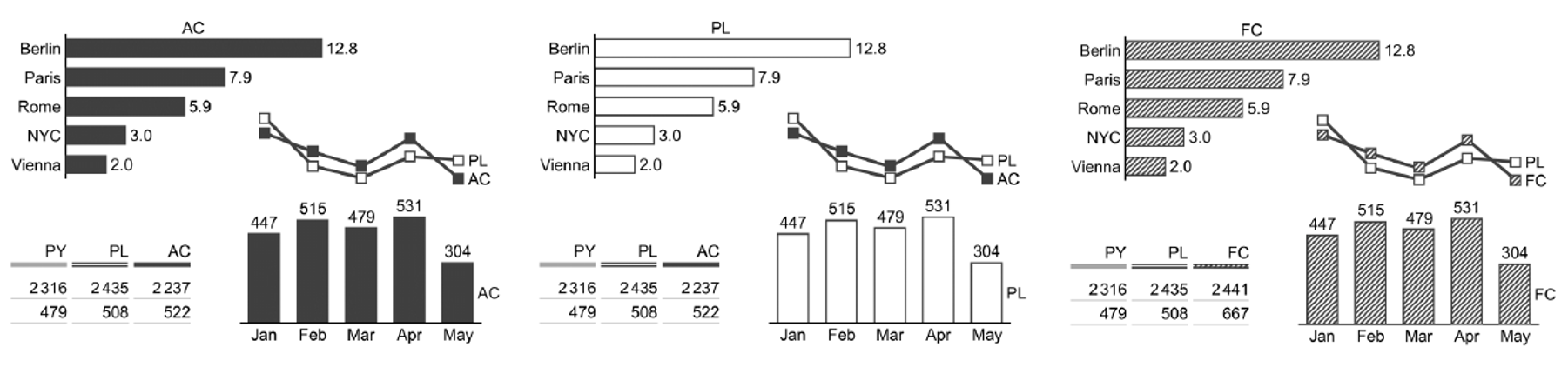
In practical terms, this is why IBCS notation rules focus on constraining how information is encoded. Time is placed consistently on the horizontal axis to preserve sequencing. Categories are compared vertically to maintain comparability. Semantic distinctions such as actual, budget, and forecast are encoded through stable visual attributes – for example filled, outlined, or hatched shapes – rather than colour or annotation. These conventions do not add analytical logic, but they prevent it from being distorted. By reducing interpretive freedom, they ensure that relationships, comparisons, and meanings remain stable across readers and reporting cycles.
The figure below illustrates how visual notation can preserve analytical meaning without altering structure. Only semantic meaning – actual, plan, and forecast – is encoded through stable visual attributes. No explanation is required to distinguish them, and no reinterpretation is introduced.
Why standards cannot substitute for analysis
It is tempting to treat visual standards as a shortcut to clarity – to assume that an IBCS-compliant chart is, by virtue of its compliance, structurally sound. This is a category error.
Standards regulate representation, not reasoning. A visually correct chart can faithfully encode flawed logic. When this happens, visual discipline does not rescue the analysis; it exposes its weaknesses more clearly.
This asymmetry is important. Analytical soundness is a precondition of structure. Visual discipline is a condition of its preservation. Neither can substitute for the other, and neither can be evaluated in isolation.
While IBCS embeds important analytical conventions, its authority lies in how reasoning is rendered visible, not in determining whether that reasoning is valid.
Standards as constraints under organisational pressure
The value of IBCS becomes most apparent in recurring management reporting. Over time, organisational pressures favour simplification, emphasis, and narrative convenience. Without constraint, visual forms drift: scales shift, comparisons erode, and exceptions proliferate.
IBCS provides a stabilising force. By constraining how information may be shown, it limits the degrees of freedom through which structure can be unintentionally weakened. In this sense, standards protect not only visual consistency, but structural stability over time.
This is also why IBCS should not be reduced to a presentation guideline. Its real contribution lies in sustaining inspectability across periods, audiences, and revisions.
Positioning IBCS correctly
Seen in this light, IBCS occupies a precise position within structural analysis:
- It does not determine what is analysed.
- It does not determine why outcomes change.
- It determines whether valid reasoning remains visible once analysis is rendered.
IBCS is therefore neither optional nor sufficient. It is necessary for faithful visual encoding, but powerless in the absence of analytical soundness.
Structural analysis emerges only when both are present.
With analytical soundness providing valid reasoning, and visualisation discipline preserving that reasoning in visible form, inspectability becomes possible. The remaining question is how such structures behave when they are reused, repeated, and institutionalised – which is the concern of recurring performance reporting.
8. Recurrence and the Preservation of Structure
In management reporting, structural analysis is rarely a one-off exercise. Visualisations are reused across recurring cycles – monthly, quarterly, or annually – and updated with new data under time pressure. Under these conditions, the central risk is not initial misunderstanding, but structural drift over time.
Recurrence places a specific burden on visualisation discipline. When visuals are revised repeatedly, small deviations accumulate: scales shift to accommodate exceptions, encodings are adjusted for emphasis, and comparisons are quietly weakened. Each change may appear locally reasonable, yet collectively they erode the conditions required for inspectability.
Disciplined visualisation limits these degrees of freedom. Stable scales, consistent encodings, and preserved comparison structures ensure that analytical relationships survive repetition. When visual forms are constrained in this way, new data can be introduced without altering the logic through which it is inspected. Structure remains visible because the representation does not change its meaning from period to period.
Without such discipline, even analytically sound reasoning becomes progressively harder to inspect. The report may retain a familiar appearance, but comparability deteriorates and causal relationships must increasingly be re-explained. What is lost is not visual consistency, but structural continuity.
Recurrence therefore does not merely repeat analysis; it tests whether structure has been preserved. Visualisation discipline is what allows structural analysis to remain inspectable across cycles, rather than being rebuilt or reinterpreted each time.
9. Failure Modes When Visualisation Is Detached from Structure
When visualisation is detached from structural analysis, failure rarely presents as confusion. Reports often look polished, familiar, and decisive. Yet readers still find themselves asking the same questions cycle after cycle: What is really driving this? Why does this look simple but feel opaque? Why does every month require explanation? These are not communication issues. They are symptoms of structural failure.
The failure modes below operate at different points in the visualisation process, but they all degrade inspectability. Together, they explain why reasoning migrates out of visuals and into narrative.
9.1 Collapsed causality
The most fundamental failure occurs when causal relationships are compressed or obscured. Drivers are aggregated, offsets are netted, and sequencing is removed. Outcomes are presented, but the path that produced them cannot be reconstructed.
This failure manifests when readers look at a report and think:
I can see the result, but I can’t see what is actually driving it.
The visual appears explanatory, yet it no longer allows inspection of cause and effect. Reasoning becomes something to be asserted rather than examined. Once causality is collapsed, structure is no longer visible, regardless of how clean the chart appears.
9.2 Masked simplicity
A related but distinct failure occurs when complexity is hidden behind aggregation. Categories are combined, residuals absorbed, and variation treated as noise. The visual looks stable and simple, but that simplicity is achieved by concealing analytical degrees of freedom rather than by organising them.
This is the moment when readers think:
Everything looks simple, but I can’t probe it.
Structure may still exist implicitly, but it is no longer accessible through the visual. Questions that should be askable within the chart now require additional breakdowns, side analyses, or verbal explanation. Inspectability stalls because the visual no longer exposes where explanatory power resides.
9.3 Decorative richness
When analytical structure is thin or incomplete, visual richness is often added to compensate. Colour, icons, embellishment, and layout complexity are introduced to make the report feel more engaging or authoritative.
This produces a different reaction:
This looks informative, but it feels thin.
Decorative richness does not create structure. It draws attention, but it does not add inspectable reasoning. In structural terms, it increases visual effort without increasing analytical content. The visual may appear engaging, yet it remains no more examinable.
9.4 Selective emphasis and interpretive drift
Under recurring reporting, a further failure emerges over time. Visual emphasis is adjusted to suit each reporting cycle: scales shift to accommodate exceptions, ordering changes to highlight particular messages, and visual cues migrate subtly from period to period.
Individually, these adjustments appear reasonable. Collectively, they undermine comparability. The report retains a familiar appearance, yet its meaning drifts.
This is when readers experience:
We seem to explain the same thing differently each month.
Inspectability degrades not because the analysis has changed, but because the visual encoding no longer preserves it consistently across time.
9.5 Narrative substitution as a consequence
When any combination of the above failures occurs, visualisation can no longer sustain inspection. At that point, narrative expands to compensate. Commentary supplies causal claims, reconciliations, and interpretations that the visuals no longer encode. Visualisation becomes the visual accompaniment to explanation rather than the surface on which reasoning can be examined.
This produces the final, familiar response:
Just talk me through it.
Narrative substitution is not a failure mode in its own right. It is the system’s adaptive response once structure has already been lost. Reasoning migrates into prose because it can no longer be examined visually. Authority shifts from inspection to explanation.
Structural diagnosis, not stylistic critique
These failures persist because they are often treated as matters of style, preference, or stakeholder communication. From a structural perspective, the diagnosis is simpler. Where visualisation fails to preserve causal relationships, comparability, and decomposability, inspectability is lost.
Poor visuals are not merely unclear. They are analytically consequential. They determine whether reasoning can be examined, questioned, and trusted over time.
Conclusion: Making Structure Inspectable
Structural analysis is not defined by the techniques used to produce it, nor by the visual sophistication of the artefacts through which it is presented. It exists only where reasoning can be inspected – where causal relationships, trade-offs, and assumptions can be examined directly, without reliance on explanation.
In management reporting, data visualisation is the interface through which inspectability is either preserved or lost. Charts are the means by which reasoning is externalised and shared. When they preserve analytical soundness through faithful visual encoding, they allow structure to become a stable organisational asset. When they do not, reasoning remains private, and conclusions must be defended narratively rather than examined analytically.
The cost of this distinction is not aesthetic. It is systemic. Where structure cannot be inspected, understanding does not accumulate, comparison degrades, and explanation replaces examination. Reporting becomes a sequence of persuasive episodes rather than a durable decision-support system.
Standards and disciplines, such as those promoted by IBCS, play an essential role in preserving inspectability, particularly under the pressures of recurrence. But no standard can compensate for unsound reasoning, and no visual polish can substitute for structural coherence. Analytical soundness and disciplined visualisation are complementary conditions, not interchangeable ones.
Seen in this light, data visualisation is neither a downstream concern nor a matter of presentation. It is the interface through which analytical thinking becomes examinable, reusable, and trustworthy. Treating it as such does not require more charts, more decoration, or more narrative. It requires designing visualisation as a structural medium – one that preserves logic, constrains interpretation, and allows reasoning to be inspected over time.
This is the threshold at which management reporting moves from explanation to examination, and from persuasion to understanding.
© 2026 Colin Wu. All rights reserved.
Quotations permitted with attribution. No reproduction without permission.