Using Colour to Encode Meaning in Financial Models

Reconciling financial-modelling notation with ISO 24896 and IBCS 2.0 to improve clarity, consistency and auditability
What a financial model communicates
A financial model communicates two related things. Model mechanics explain how the model works – which values are entered, which are calculated, how information moves between schedules, where calculation flow departs from its intended direction, and which parts of the model remain temporary or incomplete. Business meaning explains how the results should be interpreted – whether a variance or movement is desirable or undesirable, whether its impact is neutral or ambiguous, and which results deserve attention.
These two forms of communication answer two different questions: How was this number produced? and What does this number mean?
Colour is one part of the visual language available to communicate both. Used consistently, it allows readers to recognise different types of information more quickly without repeatedly inspecting formulas, labels or guides.
The widely used colour conventions in financial modelling, however, have developed largely around the first of these purposes: communicating model mechanics. Business reporting has developed another visual language in which colour is used more explicitly to communicate business meaning.
Colour in financial-modelling practice
Financial-modelling standards and guidance have long used colour and other visual treatments to make model construction more transparent. The precise conventions vary, although their primary purpose is generally structural: helping a modeller or reviewer understand what a cell, formula or relationship is doing.
The FAST Standard – named for its principles of Flexible, Appropriate, Structured and Transparent modelling – uses red font for exports and blue font for imports. FAST explains that the particular choice of colours carries less importance than maintaining a shared modelling language that practitioners can decode consistently. FAST also uses grey shading for intra-sheet counter-flow, making an exception to the normal calculation direction visible, and identifies temporary code through yellow shading together with an explicit bracketed label.
The Financial Modeling Institute (FMI) identifies blue for inputs and black for formulas or links within the same sheet as a common convention in its Advanced Financial Modeler (AFM) Body of Knowledge. It also allows a third dark colour for cells linked to assumptions tabs or another purpose defined by the modeller.
The Corporate Finance Institute (CFI) similarly recommends blue font for inputs and black for formulas or links, describing these as widely used conventions in financial modelling. It notes that green is becoming more common for links to another worksheet, while other categories such as workbook links, hyperlinks and external data have no clear colour convention.
These sources therefore do not establish a single universal financial-modelling colour palette. They share a more fundamental purpose: visual notation should make model mechanics easier to recognise and understand. Blue inputs, black formulas, coloured imports or exports, shaded counter-flow and marked temporary code are different ways of making the structure and behaviour of a model visible.
Colour in business reporting
Business reporting approaches colour from another direction. Its primary concern is how information should be interpreted by the audience.
ISO 24896:2026 was developed from the notation principles of the International Business Communication Standards (IBCS), extracting and formalising a substantial part of that notation as an international standard. IBCS 2.0 now uses ISO 24896 as the authoritative foundation for its notation guidance while continuing to provide explanations, examples, extensions and broader composition principles concerned with how information is structured and communicated.
In this context, semantic notation means that a visual treatment carries a defined and consistent meaning. Colour can therefore communicate whether an impact is desirable, undesirable, neutral or ambiguous. For variances, ISO 24896 and IBCS 2.0 use green for desirable impact, red for undesirable impact and blue for neutral or ambiguous impact, while the numerical sign separately communicates whether the underlying difference is positive or negative.
The purpose is different from most financial-modelling colour conventions. A blue font in a model may communicate “this value is an input”. A green graphical treatment in a business report may communicate “this development is desirable”. Both uses are meaningful, although one concerns model mechanics and the other business meaning.
Misalignment within a shared visual language
Because a financial model communicates both model mechanics and business meaning, these two uses of colour ultimately have to operate within the same visual language. Several existing colour assignments are therefore misaligned with that combined purpose.
Red – FAST uses red for exports, while semantic business reporting uses red to communicate undesirable impact.
Green – CFI notes the increasing use of green for links to another worksheet, while green carries a strong desirable association in business reporting.
Blue – Blue has an established role in financial modelling – FMI and CFI associate it with inputs and FAST uses it for imports – while semantic reporting also uses blue for neutral or ambiguous business impact.
The issue goes beyond disagreement over a preferred palette. A technical assignment does not remove the associations that a colour already carries for the reader. A modeller can learn that red font identifies an export, yet red can still suggest warning, adverse impact or something requiring attention. Green can identify a worksheet link while continuing to suggest that something is favourable or acceptable.
Colour is also a limited visual resource. The constraint is not the number of hues available in software; it is the number of distinctions that readers can recognise, remember and interpret consistently. Every additional use of colour consumes some of that capacity and invites the reader to look for meaning in the distinction.
Because a financial model communicates both model mechanics and business meaning, its visual language needs to support both forms of communication coherently. The existing colour conventions, developed largely for one purpose or the other, are not always aligned with that combined requirement.
The question is therefore how these conventions should be reconciled so that both forms of communication remain coherent.
Three principles for reconciling colour
1. Respect the strongest existing meanings first
Colours do not always enter a model as neutral symbols. Some already carry strong and widely recognised associations. Red and green are the clearest examples: red commonly signals adverse conditions, warning or attention, while green commonly signals desirable, acceptable or positive conditions.
Where an existing colour has a strong business meaning, that meaning should take priority over a weaker technical assignment. This is consistent with ISO 24896 and IBCS 2.0, which use green for desirable variance impact and red for undesirable variance impact. Red and green should therefore remain primarily available for meanings that directly affect business interpretation.
2. Preserve established modelling conventions where they remain compatible
Reconciliation should retain modelling conventions that are already familiar and do not create significant semantic conflict. Blue font for direct inputs is particularly well established: FMI identifies blue inputs and black formulas or same-sheet links as a common convention, while CFI recommends blue inputs and black formulas or links.
Black therefore remains a natural default for calculations. FAST's grey shading for counter-flow also works well because it makes a structural exception visible without consuming a colour with a strong evaluative meaning. Its yellow treatment for temporary code similarly carries a useful technical meaning and is reinforced by an explicit bracketed label.
3. Synchronise the conventions where they conflict
Where established modelling conventions compete with stronger semantic meanings, the conventions can be adjusted deliberately. Red and green remain primarily available for undesirable and desirable business meaning; blue font remains available for direct inputs, black for calculations, pale-grey fill for counter-flow and yellow with an explicit marker for temporary code. Other technical meanings can use colours that remain distinctive without creating a stronger conflicting interpretation.
The resulting hierarchy is simple: respect strong existing meanings first, preserve established professional conventions where they remain compatible, and adjust the conventions where they need to work together.
A proposed notation for selected financial-modelling components
The discussion here is deliberately selective. It focuses on colour coding for several important components commonly encountered in financial models, particularly where the visual language used for model mechanics needs to remain coherent with the business meaning communicated by the model. It is not intended as an exhaustive catalogue of every element that may require notation. Where a model communicates business meaning – whether through a presentation sheet, an analytical table, a variance analysis, a marker or another visual component – I recommend applying ISO 24896 and IBCS 2.0 semantic notation where relevant. Their detailed application is outside the scope of this article.
Applying the three principles to these selected components, together with the corresponding semantic treatments for business meaning, produces the following proposal:
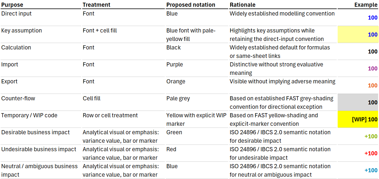
The purple and orange assignments are deliberate reconciliation choices rather than conventions taken directly from FAST, FMI or CFI.
FAST uses blue for imports, while blue already has a particularly strong cross-standard role for direct inputs. FMI and CFI both recognise blue inputs as established modelling practice. Purple allows an import to remain identifiable without competing with that stronger convention.
FAST uses red for exports. Red carries a much stronger adverse business association, so orange provides a distinctive alternative without implying that the dependency itself is undesirable. The distinction between import and export remains valuable because it communicates direction: an import is information being consumed by a schedule; an export is information being supplied elsewhere. FAST uses imports and exports to show how information flows between worksheets, while recommending that inter-sheet linking be kept to a minimum.
Yellow can support two clearly differentiated purposes. FAST uses yellow shading with an explicit marker to identify temporary code during model development. In this proposal, that temporary-code treatment is rendered in a stronger yellow, while pale-yellow fill combined with blue font identifies key input assumptions. In a completed model, temporary code would normally have been resolved or removed, whereas the key-assumption treatment can remain as a persistent part of the model. The two uses are differentiated through shade, font colour, explicit marking and their different roles in the model lifecycle.
As with any model notation, these assignments should be applied consistently and documented in the model's guide or control sheet.
Colour is one component of notation
The table focuses on colour because that is where the conflicts examined in this essay arise most visibly. A complete notation system draws on a wider visual vocabulary. Notation combines shapes, colours, patterns, line treatments, labels, position and the arrangement of these visual components to communicate meaning.
The same colour can therefore perform different roles when the complete visual treatments are clearly distinguishable. A blue font normally identifies a direct input when the font is communicating model mechanics. A blue variance number can instead indicate neutral or ambiguous business impact where the number is explicitly identified as a variance through its sign, label or analytical context. A blue graphical marker can carry the same semantic meaning. Meaning therefore depends on the complete notation and the analytical context in which the colour appears. A pale-grey cell fill can identify counter-flow while grey performs other roles elsewhere in a report.
Red and green require greater restraint because their undesirable and desirable associations tend to remain strong across different visual treatments. Other meanings can often be distinguished through the combination of colour with shape, pattern, position or labelling rather than through a new colour assignment.
Accessibility reinforces the same principle. ISO 24896 and IBCS 2.0 provide alternative treatments where hue cannot be relied on – including blue-green in place of green for readers with red-green colour deficiency and light, medium and dark grey for desirable, neutral or ambiguous, and undesirable variance impacts in monochrome – while explicit +/− signs communicate numerical direction independently of colour.
Important meanings should consequently be carried by the complete notation. FAST provides a useful example: temporary code is represented through yellow shading together with an explicit bracketed label, so the meaning is expressed by the combination of visual components rather than by hue alone.
Beyond colour: preserving meaning through integrated practice
The colour question points to a broader analytical issue. A visual treatment can carry stable meaning only when the thing it represents has first been defined consistently. What does a metric represent? How is a data element defined? What business concept does a model variable represent? What relationship exists between two measures? What does a particular variance mean for the organisation?
Colour sits near the visible end of this chain. The same semantic discipline extends upstream into data definitions, metric design, semantic models, analytical structures and data design, and downstream into reporting and decision-making. A metric whose definition changes between source data, analytical model and final report has already lost semantic coherence before any colour is applied.
A useful sequence is:
Define the meaning → preserve it through data and calculation → express it consistently through notation.
Seen from this broader perspective, a financial model forms part of an integrated information and decision system:
Business meaning → data definition → model structure → analysis → visual expression → decision
Each layer should preserve the meaning established through the preceding layers. Financial-modelling notation helps readers understand how information is produced, while semantic business-reporting notation helps them understand what that information means. Integrated analytical practice requires both.
Good analytical practice preserves meaning as information moves from data, through modelling and analysis, to reporting and decision-making. A coherent visual language is one part of preserving that meaning.
© 2026 Colin Wu. All rights reserved.
Quotations permitted with attribution. No reproduction without permission.