From Numbers to a Decision-Ready View

An illustrative example of how IBCS® / ISO 24896:2026 visualisation, analytical structure and composition shape decision-ready financial reporting
Contractor costs are forecast to exceed budget by NZD 1.20m, the largest undesirable variance in the operating result. Should management tighten contractor spending?
The accounting view points strongly in that direction. Once the underlying business mechanisms are examined, however, a blanket reduction looks much less appropriate.
This example works through the same financial result in six principal views. The first three show what consistent IBCS notation and visual conventions add to the information – making it easier to read, compare and prioritise. The fourth uses a waterfall chart to reorganise the accounting variances into a story-ready visual structure. Between the fourth and fifth views, a structural-analysis cross-map examines how those accounting movements relate to the underlying business drivers. The fifth changes the analytical structure so that the story can become explanatory. The sixth shows one illustrative way the resulting analysis could be composed into an executive decision-support message.
The numbers still reconcile to the same result. What changes is what the representation allows us to see, what the analytical structure allows us to understand, and eventually how that understanding is communicated.
The OPEX example is deliberately simple. The aim is to keep the financial mechanics familiar so that the effects of visual representation, analytical structure and composition can be seen without being obscured by domain complexity.
1. Start with the numbers
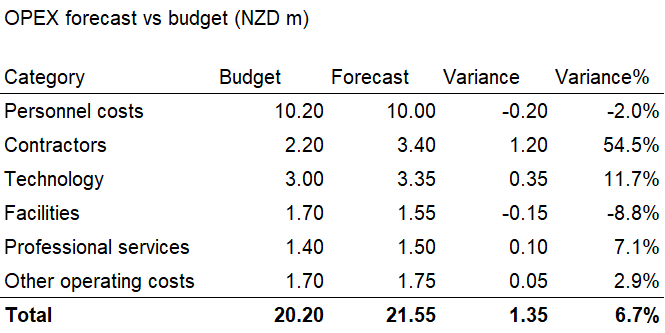
Forecast operating expenses are NZD 21.55m against a budget of NZD 20.20m – an undesirable variance of NZD 1.35m, or 6.7%.
The table contains everything needed to calculate the result, but it leaves much of the interpretive work to the reader: scanning values, comparing movements and deciding which variances deserve attention. The information is there; the reader has to work to extract it.
2. Apply a consistent visual language
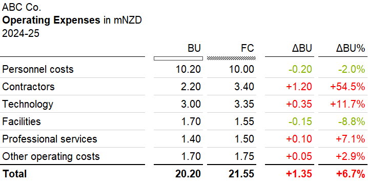
The same information is now presented using consistent IBCS notation. Budget and Forecast are represented systematically, signs are explicit, and values are aligned so that like is compared with like.
The purpose at this stage is consistency. A common visual language reduces the effort required to decode the report.
For readers unfamiliar with the notation, BU denotes Budget and FC Forecast; ΔBU and ΔBU% show the absolute and relative Forecast-to-Budget variance. Scenario notation is also encoded visually: outlined elements represent Budget or plan values, hatched elements represent Forecast values, and filled elements represent Actual values, although Actual is not shown in this example. Red and green indicate undesirable and desirable movements, rather than simply positive and negative values. In an expense view, for example, a positive cost variance is undesirable while a negative cost variance is desirable.
The financial result has not changed. What has changed is how efficiently and consistently the reader can process it.
3. Make magnitude visible
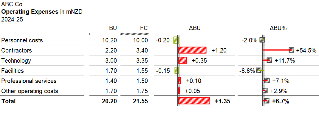
A quick guide to the notation: hatched bars and pinheads represent Forecast (FC); green and red indicate desirable and undesirable variances, rather than simply positive and negative movements; and the outlined vertical axis identifies Budget/Plan (BU) as the comparison benchmark.
Adding integrated variance charts extends the same visual language from consistency to comparison and prioritisation. Bar length represents magnitude, while position and colour make the direction and desirability of each movement immediately visible.
Contractors stand out as the largest undesirable variance. Technology is also undesirable; Personnel costs and Facilities are desirable.
The reader has moved from reading differences to seeing them. Material movements can be recognised quickly, directing attention towards the areas most likely to warrant investigation. This is an important value of IBCS visualisation: it reduces cognitive effort while making direction, magnitude and patterns easier to perceive.
The analytical structure being visualised, however, is still the accounting structure.
4. Make the result story-ready
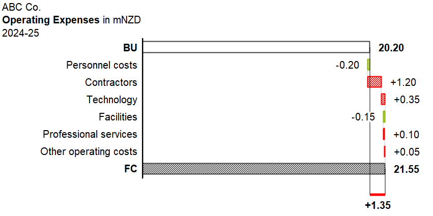
A waterfall chart takes the individual variances and organises them into a visual form that is ready to support a story. Instead of presenting each variance as a separate comparison, it creates a progression: the Budget of 20.20 moves through a sequence of changes to reach the Forecast of 21.55.
The purpose at this stage is to make the result story-ready. The chart provides a beginning, a sequence and an end point, while showing how each movement contributes to the overall +1.35m change. The movements also reconcile fully, giving the visual continuity and traceability.
This adds something Figure 3 does not. The variances are no longer independent observations; they have been organised into a visual structure from which a story can be told.
But the nature of the potential story is determined by the analytical structure underneath it. Because the decomposition follows accounting categories, the resulting view remains descriptive. It shows where the movements are recorded and how they combine to produce the Forecast, but it does not reveal the business mechanisms that produced them.
The chart can still generate useful hypotheses. Personnel costs are 0.20m below budget while Contractors are 1.20m above budget, so a reader may reasonably wonder whether the two are related. The accounting structure alone cannot establish that relationship. Personnel costs could be lower because of vacancies, delayed recruitment, changes in staff mix or other factors; Contractor costs could reflect vacancy cover, project activity, specialist capability, timing or several causes at once.
Figure 4 therefore provides a story-ready visual, but the story it supports is still descriptive. To make the story explanatory, the analytical structure itself has to change.
5. Make the story explanatory
To support action, the next step is to make the story explanatory.
Structural analysis examines what actually happened in the business: the events, constraints and decisions behind the financial movements, how they relate to one another, and how those relationships produced the reported outcome. As discussed in Structural Analysis Is the Inverse Problem of Modelling, this means working backwards from an observed outcome to the structure that could have produced it.
In this scenario, the analysis identifies a workforce-capacity mechanism:
vacancies → employee cost savings → capacity gap → contractor cover
Roles remained unfilled, creating a 0.20m personnel saving while reducing internal capacity. Covering part of that gap created 0.40m of additional contractor cost. Looked at together, the vacancies therefore produce a net +0.20m workforce-capacity cost rather than a saving.
The analysis also shows that the Contractor account contains several different mechanisms, while some individual mechanisms affect more than one accounting category.
Mapping accounts to business drivers
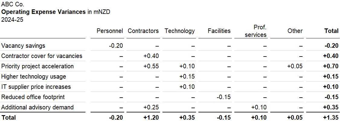
The cross-map is an analytical artefact rather than another principal reporting view. Each column reconciles to an accounting variance from Figure 4, while each row reconciles to a business driver. A value at an intersection shows where a particular driver is recorded in the accounts.
The cross-map makes the many-to-many relationship explicit. One account can contain several mechanisms, while one mechanism can affect several accounts.
The Contractor variance, for example, contains contractor cover for vacancies, priority project acceleration and additional advisory demand. Priority project acceleration, in turn, affects Contractors, Technology and Other operating costs.
This is the structural-analysis work that sits between the two waterfall views.
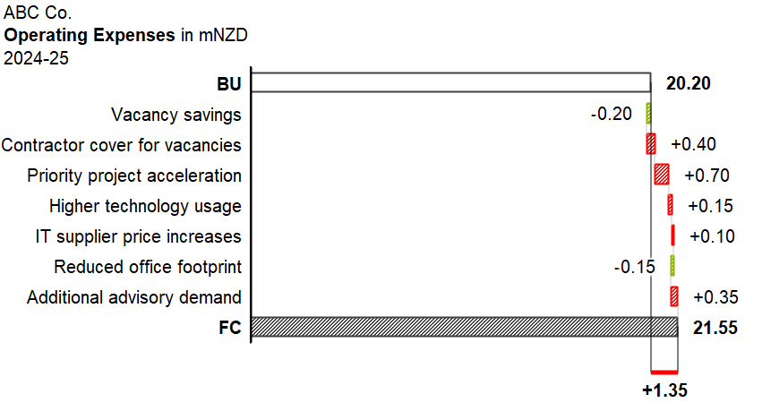
Figure 5 uses essentially the same visual form and visual language as Figure 4. Budget and Forecast remain the reference points, the intervening bars still show contributions to the movement, and the total still reconciles to +1.35m.
What changes is the basis of decomposition. Accounting categories have been replaced by the business drivers established through structural analysis.
The visual remains story-ready, but the structure now allows the story to become explanatory.
Instead of asking only where the variance was recorded, management can now ask questions such as:
What is creating the workforce-capacity gap, and what is the net cost of covering it this way?
Is the additional cost of accelerating priority work justified by the benefit of faster delivery?
Is the additional advisory capability genuinely required, for how long, and should it remain externally sourced?
Management may still conclude that contractor spending should fall. Structural analysis does not guarantee a different decision; it provides a stronger basis for making one. A blanket restriction on contractor approvals could reduce the visible Contractor variance while affecting several different business needs at once. A more targeted response might reduce vacancy cover as permanent capacity returns, assess project acceleration on its own merits, and challenge additional advisory demand separately.
A decomposition is routinely tested for whether it reconciles; it is much less often tested for whether it explains.
The visual form has barely changed between Figures 4 and 5. The analytical structure has.
6. Compose the decision-ready message
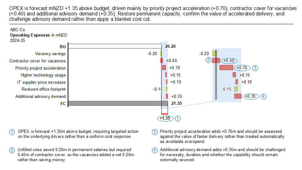
Figure 5 makes the story explanatory, but an explanatory story is not necessarily decision-ready. For an executive audience, storytelling has a further purpose: to provide context, anchor attention, explain the implications and call the reader to action.
Figure 6 is an illustrative example of how the same analysis could be composed for that purpose. It is not intended as the only or universally correct way to communicate the result. A different audience, decision or organisational context could justify a different message, emphasis or layout.
The slide first provides context by establishing the overall +1.35m OPEX variance. It then anchors attention on three management-relevant drivers: priority project acceleration of +0.70m, contractor cover for vacancies of +0.40m and additional advisory demand of +0.35m.
The numbered commentary then explains the implications of the selected evidence. Unfilled roles generated 0.20m of permanent-salary savings but required 0.40m of contractor cover, turning the apparent saving into a net +0.20m workforce-capacity cost. Project acceleration is identified as a deliberate investment decision that should be assessed against the value of faster delivery. Additional advisory demand raises questions about necessity, duration and whether the capability should remain externally sourced.
The headline completes the story with a call to action: restore permanent capacity, confirm the value of accelerated delivery and challenge advisory demand rather than apply a blanket cost cut.
The analytical work has already established what happened and why. Composition now determines what the reader should encounter first, what deserves emphasis, how the implications should be understood, and what action should follow.
The underlying analysis has not changed. What has changed is selection, sequence and emphasis.
A revealing visual provides the foundation for the story. Explanation establishes what the evidence means; composition determines which meaning should lead, how it should be supported, and what action should follow.
From visual clarity to decision support
Across the six views, three layers of work progressively come together.
Representation combines consistent notation with an appropriate visual form. Notation makes the information easier to read and compare; visual form organises the information so that relationships, magnitude and eventually a story-ready progression can be seen.
Explanation changes the analytical structure underneath that representation. Structural analysis identifies the business mechanisms behind the reported movements and determines the relationships that allow the story to explain why the numbers moved.
Composition shapes that explanatory story for a particular audience and decision. It provides context, anchors attention, explains implications and connects the analysis to action.
The progression can therefore be read quite simply: a story-ready accounting view shows how the numbers moved; an explanatory structure helps us understand why they moved; a composed executive message makes clear what matters and what should happen next.
Decision-ready reporting brings together clear representation, explanatory structure and purposeful composition.
This raises a further question: what sits beyond notation? Upstream lies the analytical work of structuring the problem and establishing the relationships that explain the result; downstream lies the compositional work of turning that explanation into a coherent story for the reader. A future article, Beyond Notation, will explore both directions in more detail.
All figures, data and scenarios in this example are synthetic and created solely for illustration.
© 2026 Colin Wu. All rights reserved.
Quotations permitted with attribution. No reproduction without permission.